
Abelara Brand Guidelines The Abelara Brand.
Powerful brands are built on clear, consistent communication.
Everything you need to tell the Abelara story consistently: logo, color, type and imagery.

Brand Story
Our Manifesto
This concise, powerful statement encapsulates the core values, beliefs and purpose of Abelara.
The more you see, the more you can improve.
Together with Abelara, ensure that you and your team have exactly what you need: The visibility and insights that drive deep ownership and accountability.
After all, it's the people, not the technology, that makes your business hum.
Promise
How Abelara becomes an integral part of people's lives and the feeling we want them to have at every encounter with our brand.
Empower people, build bridges.
We help organizations break down silos, enhance understanding and cultivate shared success.
Vision
The change we want to see, and the world we intend to create, by achieving our mission and delivering on our promise.
Every individual is empowered to reach their full potential, motivated by their ability to affect change.
Mission
Our aspirational and actionable reason for being and the difference we will make in the world.
To drive measurable improvement in people, process, and technology through access, visibility and knowledge.
We believe that when people understand their impact, they can grow it. Abelara creates a culture where learning is continuous, insights are accessible and change is meaningful.
Characteristics
These are brand personality traits that make it easier for customers to consistently recognize, relate to, engage with and endorse Abelara.
- Insightful
- We turn data into meaning.
- Empowering
- We uplift individuals to lead and grow.
- Collaborative
- We believe in breaking down silos and building together.
- Transparent
- We value clarity, openness, and trust.
- Human-Centric
- Technology should serve people, not the other way around.
- Improvement-Obsessed
- We celebrate progress, not perfection.
Visual Identity
Logo
Our primary logo is a foundational element for Abelara's visual identity. It should appear in all key communication pieces.
The logo mark is inspired by the precision of engineering schematics, and is composed of directional arrow shapes representing our points of difference: enterprise-wide integration from the bottom up, top down and from left to right. A gradient glow from within symbolizes the potential energy that Abelara helps to unlock.
Our name is a custom thin rounded sans serif in mixed case letterforms, conveying humanity, trust and modernity.




Logo Versions
While use of the full color primary logo is preferred, additional versions may be used in certain cases.
A white logo version may be reversed out of dark or photographic backgrounds lacking in proper contrast. A black primary logo version may be used on light or white backgrounds.
A stacked logo version may be considered when a composition could benefit from the presence of a more vertical logo. A white and black stacked version are also available.
Logo Mark
In certain cases, the logo mark may be used as a visual extension of the primary logo. It is intended to be used as a reinforcement of the brand when use of the primary logo would be too repetitive, large or busy.
Uses include social media favicon, presentation slides, supergraphic, or as brand reinforcement in communications where the primary logo has already appeared.




Logo Treatment
There are a few simple rules we follow to ensure our logos maintain prominence and legibility.
Clear Space
The logo and logo mark should be surrounded by clear space. At right, use 1/2 the height of the small "a" in a rectangular boundary to determine sufficient clear space. For the logo mark, use the distance between the intersection points shown to determine approximate clear space.
Minimum Sizes
The logo and logo mark should not be depicted smaller than the minimum sizes shown here.

14 px
14 px
Logo Don'ts
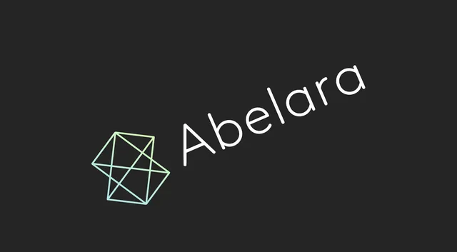
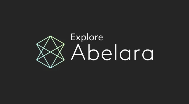
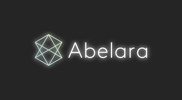
The following examples illustrate various improper applications of the logo. To maintain the logo's integrity, it should never be edited or altered. These principles apply to both the logo and the logo mark.
Color Palette
Our colors play a vital role in shaping our visual tone and reinforcing our brand characteristics.
At right is our color palette and the suggested ratio of how these colors may be used across our brand.
- White and black each have a foundational presence in our brand and communications. Our black is reminiscent of a chalkboard.
- Light Blue, Light Green and Pale Yellow are our primary hues and are inspired by the colors of chalk.
- Red provides a bold counterpoint to our hero colors as well as an accent for the system when needed.
- Gradients add energy and richness to our system and are infused into such elements as our hero photography and line illustrations.
Refer to the specifications at right to ensure consistency both digitally and in print.
Light Blue + Light Green
Light Blue + Pale Yellow
35% Red Accent + Pale Yellow
Light Green + Pale Yellow
Brand Typefaces
Our primary typefaces are Commissioner and Exo. Together, they complement each other to create an engaging system. Both typefaces are available for download from Google: Commissioner (opens in a new tab) and Exo (opens in a new tab).
Commissioner
Commissioner is used in communications to convey our brand voice. While clean and modern, it possesses a nuance and personality that brings humanity to our messaging.
Exo
Exo, used only in all-caps, is meant for smaller moments of brand communication in order to complement Commissioner.
In instances where universally accessible fonts are required (such as email), Arial should be used in place of Commissioner and Arial all-caps should be used in place of Exo.
Commissioner Regular
Aa Bb Cc Dd Ee Ff Gg Hh Ii Jj Kk Ll Mm Nn Oo Pp Qq Rr Ss Tt Uu Vv Ww Xx Yy Zz 0123456789!@#$%^&*
Commissioner Bold
Aa Bb Cc Dd Ee Ff Gg Hh Ii Jj Kk Ll Mm Nn Oo Pp Qq Rr Ss Tt Uu Vv Ww Xx Yy Zz 0123456789!@#$%^&*
Exo Medium (All Caps)
A B C D E F G H I J K L M N O P Q R S T U V W X Y Z 0123456789!@#$%^&*
Typographic Styles
To create consistency throughout our designs, we've established some primary type styles that complement one another and work together to create balanced layouts. Follow these to bring cohesion, consistency and hierarchy to our communications.
At right each style is shown in relation to its counterparts in terms of scale. While point size will change based on application, these styles should remain approximately proportional to each other as shown.
Commissioner Regular
(Example 55pt size / 62pt leading)
Headlines and display copy
Commissioner Bold
(Example 23pt size / 29pt leading)
Titles and subheads
Commissioner Regular
(Example 17pt size / 23pt leading)
This is our typical treatment for long-form body copy and other small text.
Exo Medium Caps
Tracking: 75
(Example 12pt size / 19pt leading)
Small details and captions
Photography
Abelara's photography celebrates our most central focus: the people that run our clients' enterprise. Imagery should show a cross-section of people in scenarios representative of our three pillars: Integration (workers on the factory floor); Consulting (a mix of factory and corporate employees collaborating) and Coaching (executives and coaches interacting in corporate environments).
Our brand image treatment is high-contrast black and white photography multiplied against our primary colors or gradients.
Follow these notes when selecting or creating new images:
- Subjects should be captured candidly in an editorial manner, versus appearing posed.
- Subjects should not be looking at the camera.
- Subjects should appear happy and engaged in activity, though not smiling/laughing in a forced manner.
- Scenes should be well-lit.
- Selective focus to aid in creating a clear focal point.
- Environments and props should be authentic to our lines of business.






Hero Line Treatment
When an image is used prominently, such as on a report cover, web page hero or banner, our line treatment should be used to reinforce a feeling of focus and precision.
There are two options for this treatment, non-contained (full-bleed) and contained (isolated).
Considerations
- Diagrams are made from three thin and one thick shape, all of the same size and parallel to each other.
- Line art should highlight/surround the primary action in each scenario.
- Use only white line art in the proportions and relative thickness shown.
- Use the provided art files as a starting point for creating new assets to ensure consistency.
Things to Avoid
- Don't use more than four shapes.
- Shapes should be simple and geometric.
- Don't use colors other than white.
- Don't create more than the two line thicknesses shown.
- Don't obscure faces or eyes with line art.
Contained hero line treatment is used against a simple background of our brand colors. Always use the thick outline to aid in containing the image and providing optimal emphasis on the subject.
Non-contained




Contained




Line Illustrations
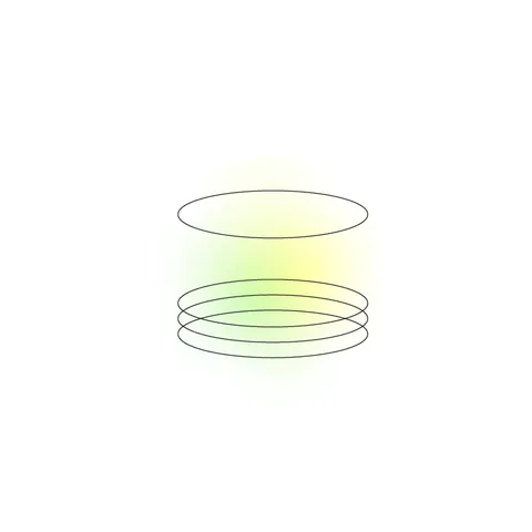
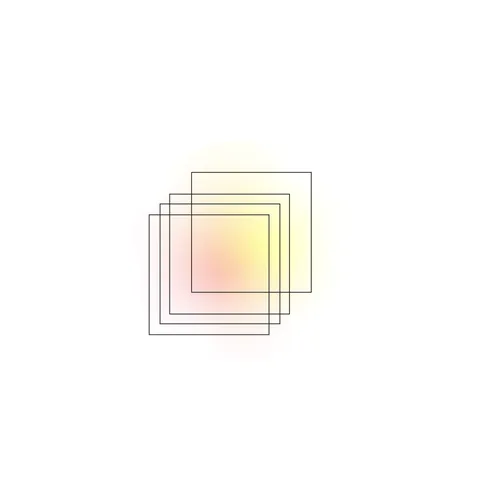
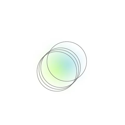
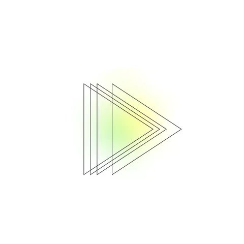
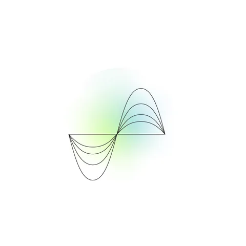
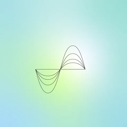
Like our logo mark, line illustrations are inspired by technical diagrams and schematics. Their simplicity and vibrancy make them an approachable and flexible tool to provide interest and bring attention to key moments.
Line illustrations may be used against a white background with a spot gradient or against a colored background with gradient.









Icon Illustrations
Icon illustrations use a contrast of subtle line art with bold shapes to highlight specific aspects of Abelara. They create ownable moments of variety and delight.
At right are suggested primary meanings for each icon illustration, although each illustration may stand in for additional subjects as needed.
Icon illustrations are intended for use against our brand black background. They may be used either as a supporting element or in a more primary role in place of photography.









Need Something Not Covered Here?
Co-branding, event materials or a file format we don't list. Tell us what you need and we'll send it.